On my blog I wrote:All the maps have been redrawn (a little larger) and the text entirely revised and Unicoded. In the ten years since the original web version, I've added a whole lot more information about Almea, so there is often more detail to add or refer to; there are also more languages done, so quite a few names have changed.
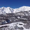
Plus I revised the climate for the whole planet, and that required a bunch of changes on the base map: the northwest of the map is now steppe and savanna rather than savanna and jungle; there's a desert south of the Barbarian Plain; and Gurdago had to be moved to the west side of Luduyn because climatically eastern Luduyn really wanted to be tundra.
I released all the earlier atlases map by map, but as this is a rewrite I decided to do it all at once. Many of you know how it turns out anyway.
(BTW, would anyone be interested in a color print version? I might make one for myself, but at least a few other Almeologists might like one for their bookshelf...)
This is great. Will get back with more substantive comments later. Do appreciate your mapping of the Cuzeian understanding of the ilii-ktuvok wars, although I previously got the sense they were more mythical then you seem to portray them. Is this really a "glimpse" of the wars, or more a guide for dealing with the count of years?
Just looking at it now. Been a long time since I looked at the old version, so I won't in any way try to compare.
I'm guessing you designed it on a large monitor with lots and lots of room, and didn't test it on a more average monitor with a more average amount of room. Because at default zoom, the text section underneath the picture is way too small. Just five lines of body-size text before I have to scroll down (I get from "introduction" to "conquer the").
I can make it look reasonable by using my browser's zoom out facility (zoom out once and it fits eight lines of text, or from "introduction" to "terrestrial history", which I'd say is a bare minimum for reasonable), but the fact that such an adjustment is necessary is going to drive people away. Nobody zooms out to read a web page unless they're already motivated.
What I'm trying to say is that it's crying out for one of those widgets that lets people drag the division between the graphic section and the text section. That would help a lot.
So, digging the Language map, better than the old one.
Secondly, did the Sainor in the last version control so much of the Southern littoral?
Some copy-editing:
- at -4000 one line just begins with "complicated." I assume there's more
- at 1525, you have "buld" instead of "built"
- At 2538 you have "Xurno qas organized"
A comment regarding the 'Quick Links' on the sidebar:
Javascript-powered links suck, because the user cannot choose to open them in a new tab (at least not in most browsers). All external links (e.g. to Almeopedia) should be implemented in HTML, giving me the power to right-click on them and choose "Open in new tab" if I so desire. (Javascript is OK for links to other atlas pages, though.)
It's a particular problem in this case because if I click the "Quick Link" to (say) Almea, and then I click the Back button to return to the atlas, I return to the front page and NOT the page I was reading.
Also note that some Quick Links are broken - e.g. Eretald. Haven't checked them all.
I found the javascript links annoying too. I don't like it when there's no immediate feedback on me clicking a link – and here it took a few seconds for the image to load.
The maps are nice, and the information looks really comprehensive, but I have to agree with some of the layout issues. Perhaps you could fit things better if the text was running down the side of a map, with the links below the map? Then it's possible to have more shorter lines which are easier and more comfortable to read than a handful of long lines?
[quote]Great wit and madness near abide, and fine a line their bounds divide.[/quote]
zompist wrote:(BTW, would anyone be interested in a color print version? I might make one for myself, but at least a few other Almeologists might like one for their bookshelf...)
Salmoneus wrote:(NB Dewrad is behaving like an adult - a petty, sarcastic and uncharitable adult, admittedly, but none the less note the infinitely higher quality of flame)
I'd get one... but I'd be more interested in a large poster of Ereláe, with all the country labels in Verdurian, if that sounds like a fun project. That'd be awesome, and I think people would buy one.
Nice. One complaint, though: the text below the maps is invisible unless you have a screen big enough (which I don't); there is no scrollbar for that frame.
...brought to you by the Weeping Elf Tha cvastam émi cvastam santham amal phelsa. -- Friedrich Schiller ESTAR-3SG:P human-OBJ only human-OBJ true-OBJ REL-LOC play-3SG:A
OK, typos fixed. I also have the internal links open in a new window (the same one each time).
What kind of toasters are you people running where the usable window size is less than 600 pixels? Nonetheless, I added a "Toggle map size" button that resizes the upper frame to 400.
The Almeopedia links with special characters fail on IE. Stupid IE.
zompist wrote:(BTW, would anyone be interested in a color print version? I might make one for myself, but at least a few other Almeologists might like one for their bookshelf...)
zompist wrote:What kind of toasters are you people running where the usable window size is less than 600 pixels? Nonetheless, I added a "Toggle map size" button that resizes the upper frame to 400.
Even on my 22" it looks a bit odd to be honest, but it's tricky to read on the 15" laptop. Even though, it's easy to use and works well, I just wonder could your great work be shown off slightly better.
[quote]Great wit and madness near abide, and fine a line their bounds divide.[/quote]
zompist wrote:What kind of toasters are you people running where the usable window size is less than 600 pixels?
Screen resolution 1280 x 720. The 21.5 inch monitor is capable of doubling that, but that makes everything too small and fidly (and intermediate settings aren't really an option with LCD monitors).
From that 720, subtract room for the Windows taskbar, browser window title bar, menu bar, tabs bar and toolbar. That leaves 595 pixels of useable space.
Nonetheless, I added a "Toggle map size" button that resizes the upper frame to 400.
Good. Now just needs to be made bigger and more prominent so people who don't know to look for it can see it.
This is exactly the reason it sucks that the standard for screen sizes has moved away from 4:3 1280x1024 to widescreen resolutions, especially on (cheap) laptops. I almost always want more vertical than horizontal space, and the atlas is a fine example of that.
I would definitely buy a print edition of the atlas. Definitely. I will peruse the web version as soon as I have access to a non-widescreen cheap laptop monitor Question though, why is this the historical atlas of Almea? Isn't it really a historical atlas of just Erelae (and really, just eastern Erelae)?
con quesa- firm believer in the right of Spanish cheese to be female if she so chooses
"There's nothing inherently different between knowing who Venusaur is and knowing who Lady Macbeth is" -Xephyr