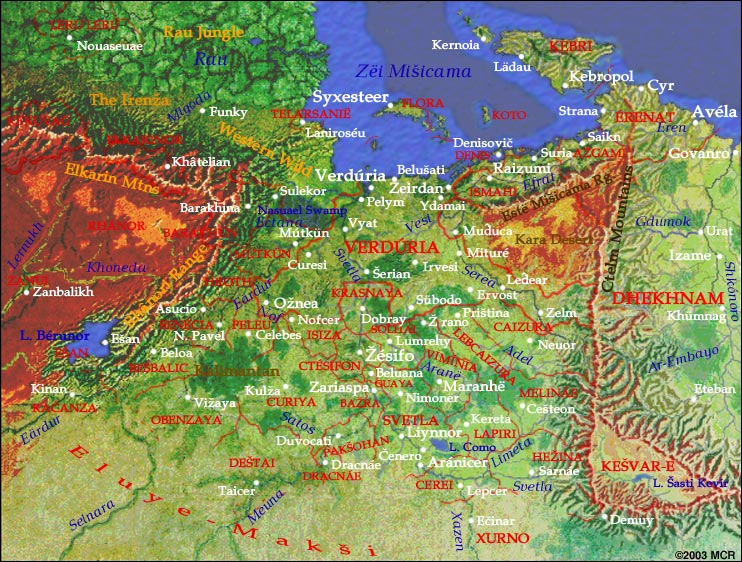
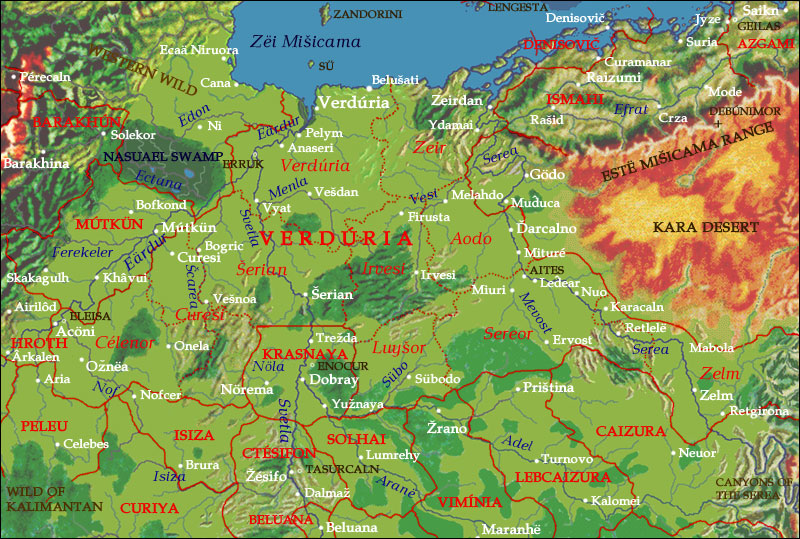
Declan wrote:The maps are nice, and the information looks really comprehensive, but I have to agree with some of the layout issues. Perhaps you could fit things better if the text was running down the side of a map, with the links below the map? Then it's possible to have more shorter lines which are easier and more comfortable to read than a handful of long lines?
I second this suggestion. Also, using frames in general feels very 1996. I wish you could limit the measure (ie. the width of each line of type) to something more managable (65 characters per line is generally regarded by typographers as gold). If you move the text to the side of the maps, this could work.
If I had been designing this, I would have had no frames, each page would be one whole. The map and the links would each be in a fixed div that wouldn't scroll, and the type in another that did, preferably on the side.
Design aside, the content is amazing. I'll be reading it over time once the semester is over. Only three more days!