Flags

Substantial postings about constructed languages and constructed worlds in general. Good place to mention your own or evaluate someone else's. Put quick questions in C&C Quickies instead.
User avatar
Torco
Smeric
Smeric
Posts: 2372
Joined: Thu Aug 30, 2007 10:45 pm
Location: Santiago de Chile

Post by Torco »

The only concountry I have developed, the First Sehlian Empire, doesn't use flags at all. It does use, however, oval-shaped emblems: they're displayed on people's shields, on city walls, painted on people's bodies, or quilted into clothing. They are familiar with the concept of a flag, but find them impractical. When they have to have a flag-like thing, say, for displaying the emblem on a square piece of cloth, they do it against a white or gray background, so that it doesn't distract from the emblem.

Image

This is the imperial emblem, the only legal one within imperial territories, which eventually turned into the whole civilized world. [not as big as it sounds, sort of the size of Australia]

At any rate, that; not a flag, but similar. Yellow signifies hope and happiness, red means dignity (from the willingness to shed blood) and black is the color of the imperial family, which brings both together, the metaphor being something like the empire makes the gallantry of warriors result in a better world. The idea of progress is completely absent from their culture, but not the idea of greater or public good.

User avatar
nils
Niš
Niš
Posts: 6
Joined: Sat Mar 15, 2008 1:21 pm
Location: Berlin, Germany

Post by nils »

Okay, these are more doodles than final designs, but I figured since we have a new Flags thread and I need flags or emblems for my science fiction universe, I'd throw something together. Think of these as seals or emblems for a large, human, interstellar nation. Very much a WIP.

Image

Image

Image

Image

Image

Image

Image
[u]Disclaimer:[/u] I am a conlanguage noob, and trying to learn. Please be patient with dumb questions I may have.

Unbidden
Sanci
Sanci
Posts: 27
Joined: Fri Mar 12, 2010 6:30 pm
Location: Australia

Post by Unbidden »

@Nils
That pentagonal seal is win! :D
[quote="Dewrad"]Oh god. It's like having a [i]really eager puppy[/i] bouncing on your chest when you're hungover.[/quote]

User avatar
Nortaneous
Sumerul
Sumerul
Posts: 4544
Joined: Mon Apr 13, 2009 1:52 am
Location: the Imperial Corridor

Post by Nortaneous »

I like the one above the fist thing. The first one has way too many stars.
Siöö jandeng raiglin zåbei tandiüłåd;
nää džunnfin kukuch vklaivei sivei tåd.
Chei. Chei. Chei. Chei. Chei. Chei. Chei.

User avatar
Aszev
Lebom
Lebom
Posts: 139
Joined: Wed Jun 23, 2004 11:43 am
Location: í Svéalandi
Contact:

Post by Aszev »

cedh audmanh wrote:
Soap wrote:Aszev's flag is likely the flag of some real world country or state. It wouldnt necessarily have to be specially made for him.
Extremadura, a province of Spain. The flag is upside down, but well...
There is to my knowledge no real world flag that is black-white-green with 1:2 proportions like mine is. (apparantly the former state of Bhopal used a similar one but I'm not sure about its proportions) Anyway the flag in that particular picture is photoshopped, but I do have an identical real flag, I just don't have a flagpole to hang it from.
Image CERVENIAN
Image JELSH
Miekko wrote:protip: no one wants to learn your conlangs. if they claim different, it's just to be friendly. this is true for all conlangers.

User avatar
Toko
Sanci
Sanci
Posts: 16
Joined: Mon Dec 10, 2007 11:11 pm

Post by Toko »

Aszev wrote:
cedh audmanh wrote:
Soap wrote:Aszev's flag is likely the flag of some real world country or state. It wouldnt necessarily have to be specially made for him.
Extremadura, a province of Spain. The flag is upside down, but well...
There is to my knowledge no real world flag that is black-white-green with 1:2 proportions like mine is. (apparantly the former state of Bhopal used a similar one but I'm not sure about its proportions) Anyway the flag in that particular picture is photoshopped, but I do have an identical real flag, I just don't have a flagpole to hang it from.
Ack we've been had!

Just kidding ;), good job on the pic . One of these days I really ought to look for some company that makes custom flags and get myself a real himachizai (instead of printing out cheap 8x11 paper ones :P )

User avatar
Catscratch
Sanci
Sanci
Posts: 15
Joined: Sat Jul 17, 2004 11:01 am
Location: Houston, Texas
Contact:

Post by Catscratch »

nils wrote:Image
Ooooh, I like this one.

User avatar
Dewrad
Sanno
Sanno
Posts: 1040
Joined: Wed Dec 04, 2002 9:02 pm

Post by Dewrad »

Unbidden wrote:
Dewrad wrote:This is required reading for all those creating their own flags. Seriously, guys: some of these are just plain hideous.
Yet, it seems to be a very naturalistic thing to have a "bad" flag.
It's "naturalistic" to own slaves, but that doesn't make it a good idea.
Some useful Dravian links: Grammar - Lexicon - Ask a Dravian
Salmoneus wrote:(NB Dewrad is behaving like an adult - a petty, sarcastic and uncharitable adult, admittedly, but none the less note the infinitely higher quality of flame)

Unbidden
Sanci
Sanci
Posts: 27
Joined: Fri Mar 12, 2010 6:30 pm
Location: Australia

Post by Unbidden »

Dewrad wrote:
Unbidden wrote:
Dewrad wrote:This is required reading for all those creating their own flags. Seriously, guys: some of these are just plain hideous.
Yet, it seems to be a very naturalistic thing to have a "bad" flag.
It's "naturalistic" to own slaves, but that doesn't make it a good idea.
My point is, sure, it might be good to have flags that are logical and obey the laws of heraldry. But, clearly a lot of nations (and states etc) on Earth have spat in the face of logic. As handy as the guide is I don't think many zbbers will be rushing to change their flags.

Every country needs quirks, even concontries, what's the harm in putting in a few imperfections. Especially if they're artistic choices?

If someone would rather be logical and design "better" flags well now they have the guide you posted to help them out....
[quote="Dewrad"]Oh god. It's like having a [i]really eager puppy[/i] bouncing on your chest when you're hungover.[/quote]

User avatar
sasasha
Sanci
Sanci
Posts: 22
Joined: Tue Oct 07, 2003 3:32 pm
Location: Yuyuþruþngyuyuþsriþ
Contact:

Post by sasasha »

Unbidden wrote:@Nils
That pentagonal seal is win! :D
Seconded. It's gorgeous.
If you were eager to learn how it might be to buy what surely would have turned out to be those sixteen cows I think I may have discussed with you (if indeed it was you whomwith I had that conversation), I'm afraid I shouldn't be able to help you.

User avatar
nils
Niš
Niš
Posts: 6
Joined: Sat Mar 15, 2008 1:21 pm
Location: Berlin, Germany

Post by nils »

sasasha wrote:
Unbidden wrote:@Nils
That pentagonal seal is win! :D
Seconded. It's gorgeous.
Hmm, thanks - interesting. It probably works well for one of those tiny interstellar nations... I'll use it :-)
[u]Disclaimer:[/u] I am a conlanguage noob, and trying to learn. Please be patient with dumb questions I may have.

User avatar
the duke of nuke
Avisaru
Avisaru
Posts: 467
Joined: Thu Apr 06, 2006 1:23 pm
Location: Leicestershire
Contact:

Post by the duke of nuke »

Some from the world of Meduzís:

Meduzís. The seven-pointed star was originally a stylised amaranth flower, and is the symbol of the Vizhosõ religion.
Image

Ushenshe.
Image

Mardosayo. The flag represents the country's three rivers, the Raisu, the Fisefu, and the Shibi.
Image

Radrakut.
Image

Zaramar. The two roses symbolise the two islands that make up the country.
Image

Tsanomai. The Lion of Nakai (Nakai-o Nanem) is an ancient emblem of the monarchy; the gold field represents the country, as the name Tsanomai derives from Old Tsanomese "great golden land".
Image

Tsarprîmait. The roundels represent pearls (tai), an allusion to the capital city Taispar.
Image
Last edited by the duke of nuke on Mon May 02, 2011 2:40 pm, edited 1 time in total.
XinuX wrote:I learned this language, but then I sneezed and now am in prison for high treason. 0/10 would not speak again.

User avatar
Qwynegold
Smeric
Smeric
Posts: 1606
Joined: Thu May 24, 2007 11:34 pm
Location: Stockholm

Post by Qwynegold »

Torco wrote:I like the green white purple better too
Me too.
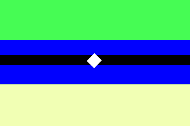
Milloniare wrote:Heres my flag
Image
Blue for the oceans, green for the fertile land and yellow for gold(prosperity)
No offense intended, but are you by any chance color blind?
Christoph Schrader wrote:Image
Nice emblem. What is it?
Astraios wrote:The flag of Sogur:

Image
I like this one a lot, but the shades of color are a little "off".
nils wrote:Image
Spiral galaxy?
nils wrote:Image
This ones really good. Haven't I seen it before?
nils wrote:Image
Fascistic spiral galaxy?
thedukeofnuke wrote:Radrakut.
Image

Zaramar. The two roses symbolise the two islands that make up the country.
Image
These two are really nice.
Image
My most recent quiz:
Eurovision Song Contest 2018

User avatar
nils
Niš
Niš
Posts: 6
Joined: Sat Mar 15, 2008 1:21 pm
Location: Berlin, Germany

Post by nils »

Qwynegold wrote:No offense intended, but are you by any chance color blind?
It could also be that the colors on his screen are just "off". My LCD tv and my LCD screen are both wildly different with some colors, as is my work LCD screen.

Qwynegold wrote:Spiral galaxy?
Yeah.
Qwynegold wrote:This ones really good. Haven't I seen it before?
Could be. I had it sitting around and wasn't sure if I had posted it in the old flags thread.
Qwynegold wrote:Fascistic spiral galaxy?
Fascist "we couldn't draw the milky way if our secret police depended on it" spiral galaxy :-)
[u]Disclaimer:[/u] I am a conlanguage noob, and trying to learn. Please be patient with dumb questions I may have.

Christopher Schröder
Avisaru
Avisaru
Posts: 310
Joined: Wed Jul 30, 2008 6:05 pm

Post by Christopher Schröder »

Qwynegold wrote:
Christoph Schrader wrote:Image
Nice emblem. What is it?
The friend with whom I collabourated made that symbol, but I think she called it a flourdeliz (fleur de lis in Breton, or something of the sort) — I just supplied the layout and palette for that one.
Last edited by Christopher Schröder on Thu Apr 29, 2010 6:03 pm, edited 1 time in total.
"Think only of the past as its remembrance gives you pleasure."
-Jane Austen, [i]Pride and Prejudice[/i]

User avatar
vampireshark
Avisaru
Avisaru
Posts: 738
Joined: Thu Dec 04, 2008 7:02 pm
Location: Luxembourg
Contact:

Post by vampireshark »

Flags!

Image
The Kingdom of Tèlemor

Image
The Ilian People's Republic
What do you see in the night?

In search of victims subjects to appear on banknotes. Inquire within.

User avatar
Dewrad
Sanno
Sanno
Posts: 1040
Joined: Wed Dec 04, 2002 9:02 pm

Post by Dewrad »

vampireshark wrote:Flags!

Image
The Kingdom of Tèlemor

Image
The Ilian People's Republic
Oh come on. That's just Thailand with blue swapped out for green (or Boyacá with the colours reversed) and some kind of mirrored Bosnia. D- for effort. Do try harder.
Some useful Dravian links: Grammar - Lexicon - Ask a Dravian
Salmoneus wrote:(NB Dewrad is behaving like an adult - a petty, sarcastic and uncharitable adult, admittedly, but none the less note the infinitely higher quality of flame)

User avatar
Dewrad
Sanno
Sanno
Posts: 1040
Joined: Wed Dec 04, 2002 9:02 pm

Post by Dewrad »

Unbidden wrote:Every country needs quirks, even concontries, what's the harm in putting in a few imperfections. Especially if they're artistic choices?

If someone would rather be logical and design "better" flags well now they have the guide you posted to help them out....
The point isn't that following the guide produces more logical or more heraldically correct flags, but flags which just plain look better. Seriously, it helps you avoid some of the ugliness that we've seen in this thread. Beauty in the eye of the beholder and everyone is a special snowflake etc etc, but some shit is just plain ugly, no matter which way you look at it. Would you like me to give examples, or would that offend your "everyone is special" principles too much?
Some useful Dravian links: Grammar - Lexicon - Ask a Dravian
Salmoneus wrote:(NB Dewrad is behaving like an adult - a petty, sarcastic and uncharitable adult, admittedly, but none the less note the infinitely higher quality of flame)

Unbidden
Sanci
Sanci
Posts: 27
Joined: Fri Mar 12, 2010 6:30 pm
Location: Australia

Post by Unbidden »

Dewrad wrote:
Unbidden wrote:Every country needs quirks, even concontries, what's the harm in putting in a few imperfections. Especially if they're artistic choices?

If someone would rather be logical and design "better" flags well now they have the guide you posted to help them out....
The point isn't that following the guide produces more logical or more heraldically correct flags, but flags which just plain look better. Seriously, it helps you avoid some of the ugliness that we've seen in this thread. Beauty in the eye of the beholder and everyone is a special snowflake etc etc, but some shit is just plain ugly, no matter which way you look at it. Would you like me to give examples, or would that offend your "everyone is special" principles too much?
Yeah, some shit is ugly, like for example your complaining.
If someone here has designed a flag clearly beauty is in the eye of the beholder.

Why should they give a dam about your personal tastes?
[quote="Dewrad"]Oh god. It's like having a [i]really eager puppy[/i] bouncing on your chest when you're hungover.[/quote]

User avatar
Dewrad
Sanno
Sanno
Posts: 1040
Joined: Wed Dec 04, 2002 9:02 pm

Post by Dewrad »

Unbidden wrote:
Dewrad wrote:
Unbidden wrote:Every country needs quirks, even concontries, what's the harm in putting in a few imperfections. Especially if they're artistic choices?

If someone would rather be logical and design "better" flags well now they have the guide you posted to help them out....
The point isn't that following the guide produces more logical or more heraldically correct flags, but flags which just plain look better. Seriously, it helps you avoid some of the ugliness that we've seen in this thread. Beauty in the eye of the beholder and everyone is a special snowflake etc etc, but some shit is just plain ugly, no matter which way you look at it. Would you like me to give examples, or would that offend your "everyone is special" principles too much?
Yeah, some shit is ugly, like for example your complaining.
If someone here has designed a flag clearly beauty is in the eye of the beholder.

Why should they give a dam about your personal tastes?
Look, look at the snowflakes! Aren't they all unique and special in their own way! ^__^
Some useful Dravian links: Grammar - Lexicon - Ask a Dravian
Salmoneus wrote:(NB Dewrad is behaving like an adult - a petty, sarcastic and uncharitable adult, admittedly, but none the less note the infinitely higher quality of flame)

Unbidden
Sanci
Sanci
Posts: 27
Joined: Fri Mar 12, 2010 6:30 pm
Location: Australia

Post by Unbidden »

Image
[quote="Dewrad"]Oh god. It's like having a [i]really eager puppy[/i] bouncing on your chest when you're hungover.[/quote]

User avatar
Catscratch
Sanci
Sanci
Posts: 15
Joined: Sat Jul 17, 2004 11:01 am
Location: Houston, Texas
Contact:

Post by Catscratch »

Oh sky cake...

User avatar
finlay
Sumerul
Sumerul
Posts: 3600
Joined: Mon Dec 22, 2003 12:35 pm
Location: Tokyo

Post by finlay »


User avatar
vampireshark
Avisaru
Avisaru
Posts: 738
Joined: Thu Dec 04, 2008 7:02 pm
Location: Luxembourg
Contact:

Post by vampireshark »

Dewrad wrote:Oh come on. That's just Thailand with blue swapped out for green (or Boyacá with the colours reversed) and some kind of mirrored Bosnia. D- for effort. Do try harder.
No, no it's not. Having a similar pattern does not make the flag identical to others. Look at the varying tricolors presented. In fact, there are about... four other differences from the Thai flag.

And the Ilian Flag was partly inspired by the Bosnian, but comes from their own history. It's not a mirrored Bosnia... I should know, because I love that flag.

Anyways, maybe this will be to your loathing more, sir.

Image
Épemale Republic
What do you see in the night?

In search of victims subjects to appear on banknotes. Inquire within.

User avatar
the duke of nuke
Avisaru
Avisaru
Posts: 467
Joined: Thu Apr 06, 2006 1:23 pm
Location: Leicestershire
Contact:

Post by the duke of nuke »

Qwynegold wrote:These two are really nice.
Thanks. I was worried that on the Zaramaran flag the roses would be a bit overpowering, and it's good to know that at least some people don't think so. As for the flag of Radrakut, I chose it partly because it looks like a chainsaw (Sanguine a bend raguly Argent).

@nils: I do like that fist-and-galaxy design. It looks very revolutionary.

@Milloniaire: I agree with Qwynegold that the colours look a bit "off", perhaps faded; maybe you could increase the saturation and decrease the luminosity.

@Dewrad: Come on, you're being a bit harsh on the man. Yes, the guide you've posted is a very good one, and yes, some flags can be very ugly indeed; but people can make ugly flags if they want to. It's certainly good to offer advice on how to improve a flag according the the opinions of yourself and the people of NAVA, but you can't force people to follow it.
XinuX wrote:I learned this language, but then I sneezed and now am in prison for high treason. 0/10 would not speak again.

Post Reply