
Ha, beat you to it. It's a nice rug though.BettyCross wrote:Looks like a rug.
JAL


I have to agree on this. It has elements of "that's pretty of neat" and "oh god, not those people again". Its flags like this that have me watch olympics opening ceremonies like car crashes. Sure I could lok in an almanac but its not the same as when people are proudly waiving it around. And yeah I wouldn't mind owning that as a rug, but I'd probably keep it in the basement or other out of the way room. At least it is interesting, mine is rather boring.Jar Jar Binks wrote:Finally a flag that is realistically awful. It's simultaneously hideous and beautiful. Well done, sir!
kewljal wrote:and Hakwane (a military dictatorship, the two squares are supposed to be golden).
Me too.doctrellor wrote:I like the flag with Orange over the yellowbenadam wrote:Here's the flag of my as-yet-embrionic concountry/nation/people:
Yes, I made it on MS Paint.
The one with yellow just seems harsh to the eyes -- while the orange seems softer. Maybe it's just me ...who knows
Cool! It looks like some kind of petroglyphs. I think it's okay as it is, except that the horse is a little meh.daryush wrote:Here's the Ala-Khanid confederation flag
It is:
The moon and a star
A bow drawn
A horse.
The horse and the bow were vital in the Ala-Khanid conquest and Ala-Medyoic wars, and the moon and star are important in the Harukanid nomadic beliefs.
The one on the right is really beautiful.nils wrote:


Unless you put some charge in the center, definitely the wide is preferred over the narrow.Izo wrote:So which do you prefer? Narrow or wide?
There are variations of the flag with centered charges. In these cases I prefer the wide one, because the charge makes the strips even narrower.TomHChappell wrote:Unless you put some charge in the center, definitely the wide is preferred over the narrow.Izo wrote:So which do you prefer? Narrow or wide?
for god's sake make your signature smallerIzo wrote:There are variations of the flag with centered charges. In these cases I prefer the wide one, because the charge makes the strips even narrower.TomHChappell wrote:Unless you put some charge in the center, definitely the wide is preferred over the narrow.Izo wrote:So which do you prefer? Narrow or wide?
There's this lovely feature in phpBB 3 that allows one to disable displaying signatures. I so love that feature.Pthug wrote:for god's sake make your signature smaller

No, you're just doing it wrong. I've seen amazing things done in GIMP, even if it's not exactly photoshop. Besides, with flag making you really really want to use a vector program like inkscape, which many agree is the best in its class.I know it's kind of sloppy but I did use GIMP. (Which is in my opinion the watered-down version of photoshop)
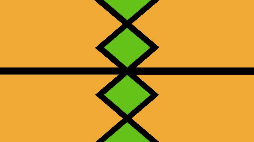
I like the combination of these colors; black and yellowish green always make a nice couple.Koko.Dk wrote:
The Faznand flag (Karani-speaking country located 3404 miles southwest of Karanorisa [the country where Karani originated]).
I know it's kind of sloppy but I did use GIMP. (Which is in my opinion the watered-down version of photoshop)
I like the design. Reminds me of a building in my city:Zoris wrote:Here's a flag I made myself in inkscape. The conworld I'm thinking up uses mostly vertical flags.