To be fair, it seems to be a Gay and Bi militia group based in Cali.BettyCross wrote:I see. You've founded a gay militia group.
Betty Cross
Flags
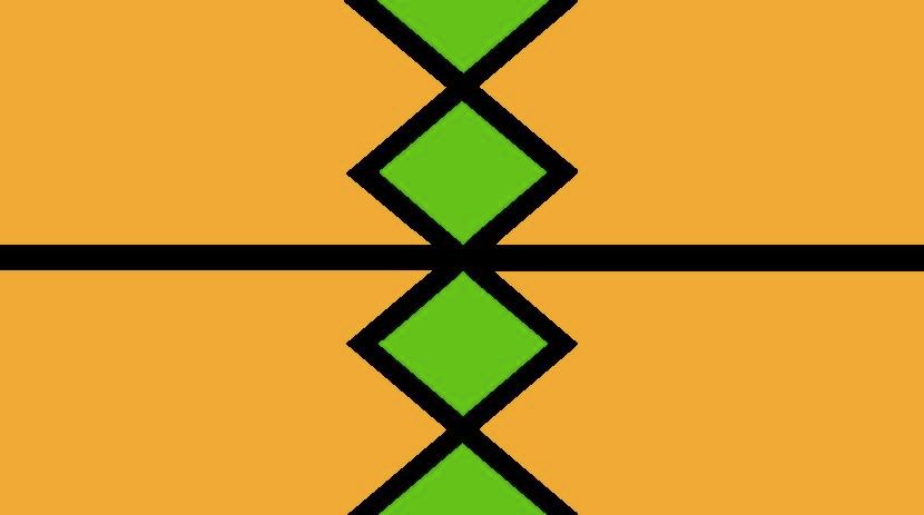
Here's the flag of my as-yet-embrionic concountry/nation/people:

Yes, I made it on MS Paint.
The black motif is the character for "man; human being; member of this nation (etc)". It is green on the inside and gold on the outside to symbolise the philosophy that a person should be outwardly like gold (i.e. beautiful, unreactive, malleable but firm), and inside like green wood (i.e. alive, ever-growing etc).
Jihámon Yhliao?
- Guitarplayer II
- Lebom

- Posts: 76
- Joined: Wed Aug 23, 2006 4:44 pm
- Location: Marburg, Germany
- Contact:
No. Use stronger colours (#FFD700 and #008000 for example). To me as a colorblind your design above looks like off-green and green. Or orange and off-orange. The intention of flags and courts of arms is that you can see from far away who is approaching you e.g. on the battlefield or in a tournament.

Made with Inkscape. Vector graphics programs are a must for flags.

Made with Inkscape. Vector graphics programs are a must for flags.
Last edited by Guitarplayer II on Tue Aug 17, 2010 9:18 am, edited 2 times in total.
giˈtaɹ.plɛɪ̯ɚ‿n dɪs.ˈgaɪz • [b][url=http://sanstitre.nfshost.com/sbk]Der Sprachbaukasten[/url][/b]
[size=84]And! [url=http://bit.ly/9dSyTI]Ayeri Reference Grammar[/url] (upd. 28 Sep 2010)[/size]
[size=84]And! [url=http://bit.ly/9dSyTI]Ayeri Reference Grammar[/url] (upd. 28 Sep 2010)[/size]
- Nortaneous
- Sumerul

- Posts: 4544
- Joined: Mon Apr 13, 2009 1:52 am
- Location: the Imperial Corridor
Apart from the colorscheme, the horizontal line is awkward. You have this extremely poignant verticle element and then just throw in this simple horizontal one. It reminds me of what they did on the flag of CAR, it just gives one a headache to look at.
Last edited by Viktor77 on Tue Aug 17, 2010 9:38 am, edited 2 times in total.
Yes! Thank you very much, it does look a lot better -- the proportions as well as the colour scheme. I've got Inkscape on my computer, but it looks so much harder to use than MS Paint. Gahh, I'll get my head round it eventually...Dampantingaya wrote:No. Use stronger colours (#FFD700 and #008000 for example). To me as a colorblind your design above looks like off-green and green. Or orange and off-orange. The intention of flags and courts of arms is that you can see from far away who is approaching you e.g. on the battlefield or in a tournament.
Made with Inkscape. Vector graphics programs are a must for flags.
Hmm... I've gotta disagree here. Apart from the fact that the black motif, including the horizontal line, is a grapheme representing a word which would lose its meaning without it, I also think that the horizontal line gives the flag a more balanced quality. I think the vertical element needs something to counter it, if you know what I mean.Viktor77 wrote:Apart from the colorscheme, the horizontal line is awkward. You have this extremely poignant verticle element and then just throw in this simple horizontal one. It reminds me of what they did on the flag of CAR, it just gives one a headache to look at.
Jihámon Yhliao?
Ok, dug up two other flags I had once designed for Nation States: Amit Razul (a theocracy, hence combining the yellow/white of the vatican with the red blood of Christ, and a green thorn crown to remind of His suffering)

and Hakwane (a military dictatorship, the two squares are supposed to be golden).

JAL
and Hakwane (a military dictatorship, the two squares are supposed to be golden).

JAL
-
doctrellor
- Sanci

- Posts: 40
- Joined: Sun Oct 19, 2003 1:26 am
- Location: Land of 10,000 lakes..:)
- Contact:
I like the flag with Orange over the yellowbenadam wrote:Here's the flag of my as-yet-embrionic concountry/nation/people:
Yes, I made it on MS Paint.
The black motif is the character for "man; human being; member of this nation (etc)". It is green on the inside and gold on the outside to symbolise the philosophy that a person should be outwardly like gold (i.e. beautiful, unreactive, malleable but firm), and inside like green wood (i.e. alive, ever-growing etc).
The one with yellow just seems harsh to the eyes -- while the orange seems softer. Maybe it's just me ...who knows
Nilikuonyesha nyota (mwezi) na uliangalia kidole tu.
I pointed out to you the stars (the moon) and all you saw was the tip of my finger.
I pointed out to you the stars (the moon) and all you saw was the tip of my finger.
Here's the Ala-Khanid confederation flag

It is:
The moon and a star
A bow drawn
A horse.
The horse and the bow were vital in the Ala-Khanid conquest and Ala-Medyoic wars, and the moon and star are important in the Harukanid nomadic beliefs.

It is:
The moon and a star
A bow drawn
A horse.
The horse and the bow were vital in the Ala-Khanid conquest and Ala-Medyoic wars, and the moon and star are important in the Harukanid nomadic beliefs.
[url=http://alamantias.wikidot.com/]Gâh-en-t-izameni maxš bâqân! (Erâni)
Visit my conworld website! (English)[/url]
Visit my conworld website! (English)[/url]

The flag of the Toretore was converted into the planetary flag after the Great war.
The old meaning: The three star represented the steps it takes to entreaty a god to your service, five to each of the three minor gods, fifteen to the largest god.
The yellow cross shows that the over-god reaches across the world and holds the people in place. The blue and purple show that the nature and the people can live together.
The New meaning: The three stars represent the three over-gods, the yellow, purple and blue the three sentient species.
Soušui igo nuř bangoř heurlich
I wish only to be happy
I wish only to be happy
Rosmwr Flag
Hopefully that link works. I'm still having such a hard time figuring out how to use google sites to link directly to a picture instead of a storage or gallery page.
I had debated on the color scheme. I had wanted to include black in the design besides the green and yellow but couldn't come up with anything that looked decent. I think it came out alright, if somewhat simple.
- the duke of nuke
- Avisaru

- Posts: 467
- Joined: Thu Apr 06, 2006 1:23 pm
- Location: Leicestershire
- Contact:
This isn't a flag generator per se, but it's pretty good. I used it for all my flag creation including the avatar you see to the left of this post.
XinuX wrote:I learned this language, but then I sneezed and now am in prison for high treason. 0/10 would not speak again.
Oh that reminds me, here are some banners I made up last week. Mostly as place holders til I can put more time into the design. Most of the symbols are Public Domain, from http://openclipart.org/

A few of them are probably OK.

A few of them are probably OK.
[u]Disclaimer:[/u] I am a conlanguage noob, and trying to learn. Please be patient with dumb questions I may have.
Yeah, I was hear way back when the flag generator was put forth by one of the forum members, but now when I search for it I can't find it!
Is everyone just using vector graphics now?
It was a really great tool, please somebody help!
Is everyone just using vector graphics now?
It was a really great tool, please somebody help!
Danger is my name, conlang is my game.
[url=http://makealang.blogspot.com]Make A Lang[/url] is my blog
[url=http://makealang.blogspot.com]Make A Lang[/url] is my blog
- BettyCross
- Sanci

- Posts: 18
- Joined: Mon Jun 26, 2006 8:44 pm
- Location: NC Research Triangle

 chuj flag
 Kirkov-Pataari flag